I am currently looking into setting up a way to do commissions for pay. The rate will be a 10 USD per commission and a shipping rate to be determined later. This is a base rate and additional fees will be added for special material requests. Here is what the base commission will get you:
A fully colored piece on a 9''x12'' inch Smooth Bristol Board. The piece will be colored in marker and inked with a .8 Micron Inkpen. This provides a bold clean look to the piece and will be wall worthy. The commission will be mailed to you along with any and all sketch work I will do in order to prep for the final piece.
There is only a few things I ask when it comes to commissions- 1) I will be allowed to scan and post the piece on the website as a way to advertise and provide examples for future customers. 2) That you could take a picture of you with it when it arrives. I will post it on the website if you want, but this tells me that it arrived safely. 3) Recommend me to your friends if you are happy with the piece.
Now there is a way to receive a free commission. That is through twitter based contests. Follow me at http://twitter.com/JordanCJennings and throughout the day I will post a comic trivia question. At the end of the day I will pick a random correct answer and give the person a free commission. Now some days I might do another contest in place of the Comic Trivia but the trivia will be the basic contest.
So email me at Comicbookoverkill@gmail.com to discuss commissions and be sure to keep checking out twitter for free commission contests
One Eyed Illustrations
Tuesday, July 13, 2010
Wednesday, May 19, 2010
Cyclops Minimalism piece
In between working on the strip (which you should check out by the way), playing my DS, and Job Hunting I do random bits of art. This one is not related to the Lantern Project, but instead just a one of, for now. It's a Cyclops Minimalist piece.
Is it artsy? Maybe. Was it simple and fun to do? Oh yeah. I love doing this stuff. The only thing I hated was that my marker wanted to give out during the coloring process. Though it led to me using another shade of blue and made the piece look nicer. I liked that. I might do more minimalism, but not too sure. If I get the inspiration I will do it, but for now sit back and enjoy this one piece.
Is it artsy? Maybe. Was it simple and fun to do? Oh yeah. I love doing this stuff. The only thing I hated was that my marker wanted to give out during the coloring process. Though it led to me using another shade of blue and made the piece look nicer. I liked that. I might do more minimalism, but not too sure. If I get the inspiration I will do it, but for now sit back and enjoy this one piece.
Wednesday, May 12, 2010
New Art Project: The Lanterns #1
Here I am again folks to bring you the first piece in a new Art Project. I started on this project a while back. Right around the end of the Comic Coalition project but I've been distracted by school and Mere Mortals to get to do it. Well with Mere Mortals having found a home (http://meremortals.thecomicseries.com/ Updates every Sunday and Wednesday) and school being out I have time to do some art work. This project is a simple set of what if's and re-imaginings. It's simply titled the Lanterns and was prompted by a discussion on twitter about how some of the DC characters were a better fit for certain Lantern Corps as temporary members than the ones that were selected.
For today we have the selection I best see fit for the Sinestro Corps and that's Batman. "Now wait a minute," you might be asking yourself, "Batman was 'dead' and a black lantern. He couldn't be a Sinestro Corps member." Well first, this sorta already happened a while back before the Sinestro Corps war when a yellow power ring tried to enlist Batman into the Sinestro Corps and second Wonder Woman was able to overcome being 'dead' with the power of the Star Sapphire Ring. Though to be fair she was living before she became a reluctant member of the Black Lanterns. So that might factor into why Batman wasn't picked for the honorary deputy of the Sinestro Corps (I have an image of a Yellow Lantern Barney Fifth now).
Now why did I pick Batman for the Sinestro Corps spot? Well it's primarily because to me Batman instills a lot of fear into his villains and that screams yellow ring. Also I like to draw Batman, so yeah, there's that. Now I guess it's time to introduce you to the art.
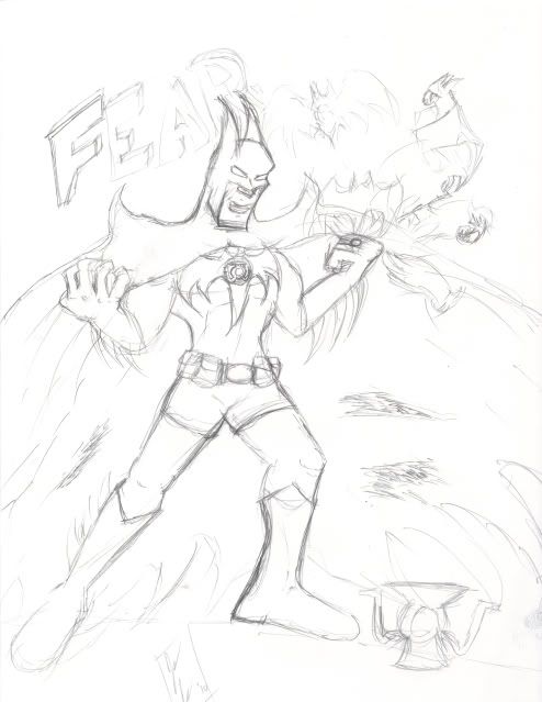
First I have the quick sketch I did a while back for this idea:
First you may notice I decided not to use the Sinestro outfit that was given to him in the comic image above. Reasons for that are 1) I didn't like it. It looked too much like Sinestro's old costume before the War. 2) I didn't have it on hand to reference so I went from memory and what I thought worked. You may notice the curtain rod cape that he's wearing and that's because I thought of the weird gothic Batman art design you occasionally see in comics. Also there are oversized blades on the arms and legs. I done this to make him look more intimidating and fear inducing. For the symbol I just drew an oversized bat and placed the Lantern Corps logo in the center. Unknowingly I made the bat match Sinestro Corps' costume design. That was accidental but awesome. Not much else to say about the sketch.
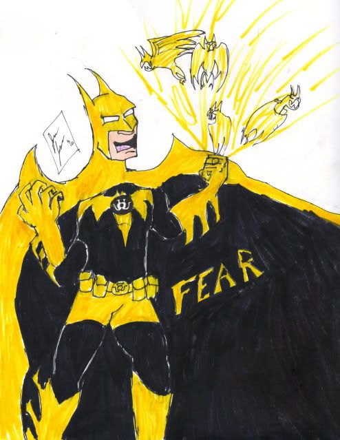
Now here is the final inked and colored version
Now there are some differences between the sketch and the final version. The biggest one is the change in pose. The sketch was more dynamic looking and this one isn't as dynamic. I don't know why but that's how it came out. The other big difference is the removal of the Lantern and the new placement of the "fear" blurb. There are a couple first for this picture. This is the first time I've fully colored something for the site. That includes provide a realistic flesh coloring to the character. Makes the piece look infinitely better when compared to others. One thing I do like about this piece is the use of black. It fills up almost half the page and would've been the whole page if my marker didn't give out during this piece. Overall I love this piece and how well it came together considering I have not that much experience in actually coloring my own pieces in a semi-competent way.
That's all for now. Remember to check out Mere Mortals every Sunday and Wednesday for new comics. Oh what you know it's Wednesday. Check it out. Also RIP black marker. You've been a great tool considering you were dirt cheap.
Now to go buy a new Black brush-tip pen/marker.
Labels:
Batman,
Mere Mortals,
Sinestro Corps Batman,
The lanterns
Wednesday, May 5, 2010
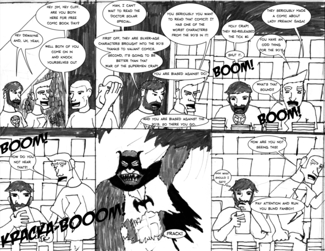
Mere Mortals 002- Free Comic Book Day part 2
Click to enlarge
Here is strip 002. I'm still waiting on the confirmation to Comic Genesis. So I will continue hosting on here. Now for some commentary on the strip- I decided to digitally letter this comic after the disappointment of my crappy hand lettering. I use the vector tool in Inkscape. The program is very intuitive and easy to use. The only problem I'm having is that it likes to crash. I just make frequent saves to combat this. Oh the digital font is from Blambot. Awesome site if you are looking for comic fonts for free and pay. I've been using blambot for nearly a year for some awesome fonts and this is the first time I used it for a comic.
Join me next time for some art and hopefully the URL for the Comic Genesis site.
Sunday, May 2, 2010
Mere Mortals 002- Free Preview
Hey all the big companies are doing it. Figured I should offer a preview of the recently finished Strip of Mere Mortals now with Digital Lettering.
Click to enlarge
Just like other previews the words have been removed to prevent any spoilers. Now what's with the giant monkey!? What's Jim thinking!? And why are the duo mad at each other? Check back Wednesday to find out!
Saturday, May 1, 2010
Mere Mortals 001- Free Comic Book Day
Click to enlarge
Well here it is folks, Mere Mortals Strip 001. Right now it's currently hosted on this blog while I await verification over at Comic Genesis. Should be up and running by the time Strip 002 is set to go online. Well I guess I should have some commentary on the comic. This strip was the most complicated of the first few strips since it has so many things going on in the background. Also I need to work on my lettering and find my darn ruler. Can't draw a straight line to save my life. Overall I am pleased with this comic and I think the next few strips will continue to get better.
See you all Wednesday for Strip 002 and hopefully a webcomic site.
Wednesday, April 28, 2010
Mere Mortals Promo Image- work in progress
Figured I would chart process that goes behind the development of a Mere Mortals promo image. First one I've done for the comic and I Figured I should as Saturday's release date is looming. When coming up with the sketch I was stuck trying to decide on the pose. At first I was going to do a homage cover of Amazing Fantasy #15, but decided not to do that one just yet. So instead I went with a more original route and done a set of poses in which the characters show their fandom. Here is the first sketch-
Mere Mortals promo image sketch
Nothing to this one, I'm basically laying out the pose and including the weaponry for Cliff and Jim to wield. I decided that Jim should carry Thor's Hammer and Captain America's shield. The shield didn't make it to the sketch for the fact I didn't have a circle to trace to get the proper shape. I included the Iron Man movie t-shirt as I wanted to add elements of Iron Man to the sketch to complete Marvel's Big Three. Now for Cliff I had a more difficult time coming up with his weaponry due to DC characters not carrying much, or my mind was blanking, who knows. So I decided to include Cliff wielding eight power rings. I'm thinking Green Lantern, but it could be all eight. I also included Wonder Woman's bracelets, Batman's Utility belt and Superman's Shield to the shirt to give the complete DC Trinity.
Now the next level
Mere Mortals promo image phase 2
So I go from the standard copy paper and transfer over to drawing paper. Here I plan to ink the image. Also since I added Cap's massive shield I will add Iron Man's gauntlet to Jim's right arm to make up for the lack of Iron Man in the sketch. Not much different about the sketch other than the shield and slightly re-detailed face of Cliff. I am now playing around with a Masthead/Logo for the comic and you can see the first draft in the corner. I think I like it. Expect this to be ink sometime in the next few days.
Check back later for the inked image and hopefully the URL for Mere Mortals over at Comic Genesis. The first strip just needs to be inked. I am considering doing lettering by hand or digitally. Not sure there.
Subscribe to:
Posts (Atom)


